How to Use Typography to Enhance Your Brand Identity
Typography plays a crucial role in establishing a strong brand identity.
The right choice of fonts can evoke emotions, convey messages, and create a memorable visual experience for your audience. From logos and websites to marketing materials and packaging, every aspect of your brand can benefit from thoughtful typographic decisions.
In this article, we will explore how to effectively use typography to enhance your brand identity, from selecting the right fonts to maintaining consistency across different touchpoints.
Let's delve into the world of fonts and unleash the power of typography for your brand.
Understand Your Brand Personality
Before diving into the world of typography, it's essential to have a clear understanding of your brand's personality and values.
Is your brand modern and edgy, or traditional and sophisticated? Is it playful and energetic, or minimalistic and elegant? By defining your brand's personality traits, you can align your typography choices with your overall brand image and create a cohesive visual language.
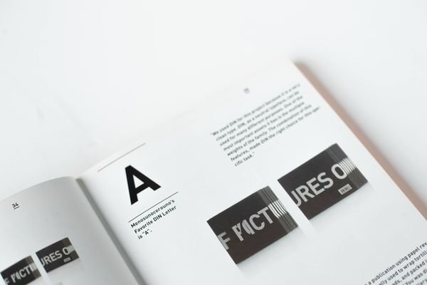
Choose the Right Typeface
Typefaces set the tone for your brand and evoke specific emotions. Selecting the right typeface is crucial for conveying your brand's message effectively. Serif fonts, such as Times New Roman or Baskerville, exude a sense of tradition, reliability, and professionalism. Sans-serif fonts like Helvetica or Arial, on the other hand, are more modern, clean, and approachable.
Script fonts convey elegance and sophistication, while display fonts can add personality and uniqueness. Choose a typeface that resonates with your brand's personality and aligns with your target audience's expectations.
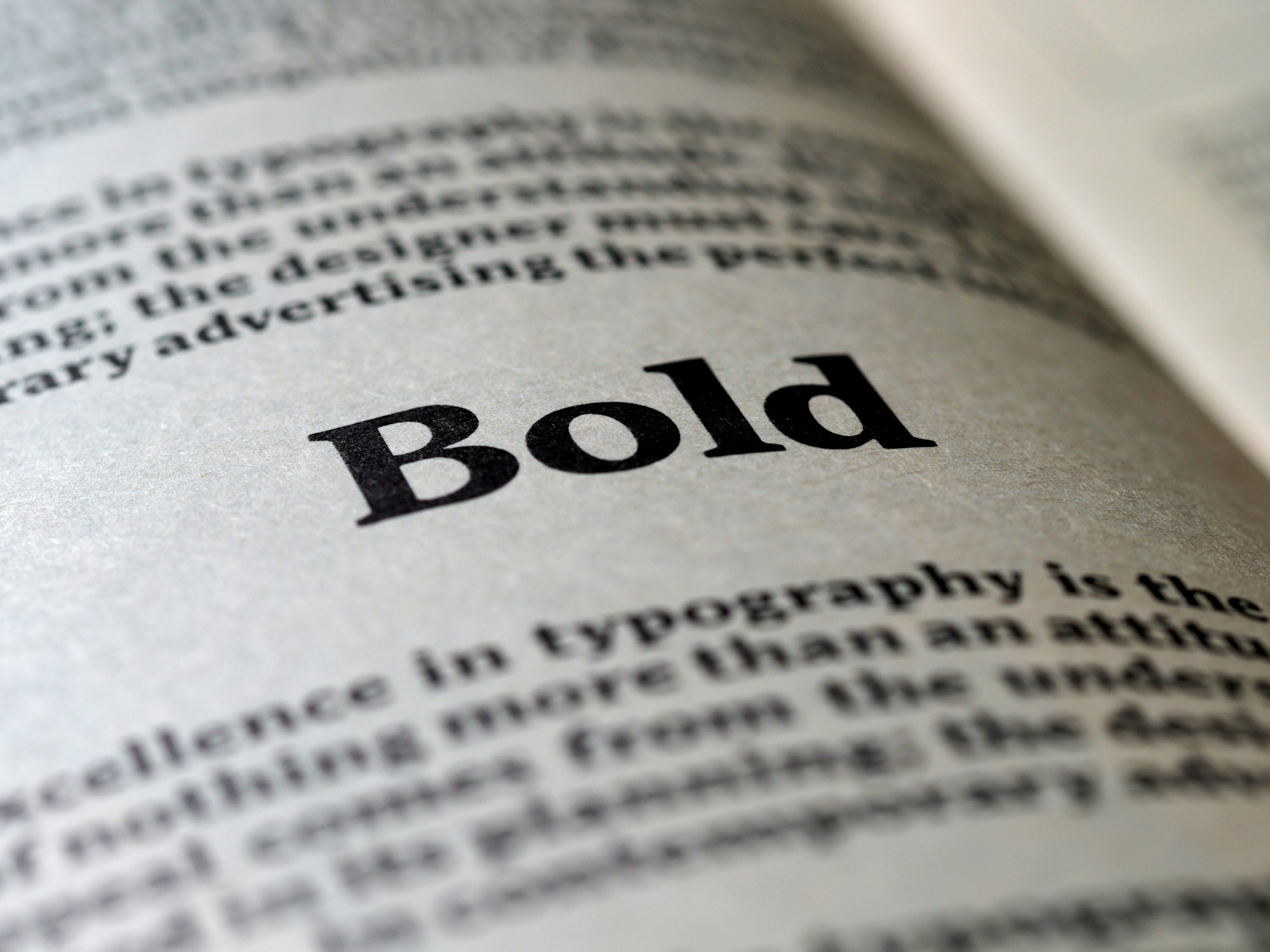
Establish Hierarchy and Consistency
Hierarchy in typography refers to the arrangement and emphasis of different text elements. By establishing a clear hierarchy, you guide your audience's attention and create visual harmony.
Use font weights, sizes, and styles to differentiate between headings, subheadings, body text, and call-to-action elements.
Consistency is key in building a strong brand identity. Define a set of typographic rules and ensure that they are followed consistently across all brand touchpoints, including your website, social media graphics, print materials, and packaging.
Consider Readability and Legibility
While creativity is important, it should never compromise readability and legibility. Ensure that your chosen fonts are easy to read across different devices and mediums.
Pay attention to factors like letter spacing, line height, and font size to optimize readability. Test your typography choices on various platforms and screen sizes to ensure that your brand's message is easily accessible and enjoyable for your audience to consume.
Use Typography as a Visual Element
Typography can go beyond conveying information and become a visual element itself. Experiment with custom lettering, ligatures, or unique typographic treatments to add personality and distinctiveness to your brand.
Consider creating a custom typeface or modifying existing fonts to reflect your brand's individuality. However, be cautious not to sacrifice readability in pursuit of creativity. Striking the right balance is crucial.
Typography is a powerful tool in shaping your brand identity and creating a lasting impression on your audience.
By understanding your brand's personality, choosing the right typeface, establishing hierarchy and consistency, prioritizing readability, and using typography as a visual element, you can leverage the power of fonts to enhance your brand identity.
Embrace the art of typography, and let your brand's voice be heard through the strokes of well-chosen letters.